
Confusing Design… Elitch’s Denver
I have a particular affection for amusement parks, so I was delighted to spend a fun day at Elitch Gardens and Water Park in Denver, Colorado. The park was small, but fun, with a decent selection of coasters and a fun little water park to boot.
Design wise it was a bit of a Disneyland pastiche, it tried to divide the park into sections with the entrance area being a Main Street themed copy, and other areas looking slightly like a Wild West (frontier land). But the park wasn’t large enough to called out specifically, but it was evident that it used Disneyland as the guiding architectural principle.
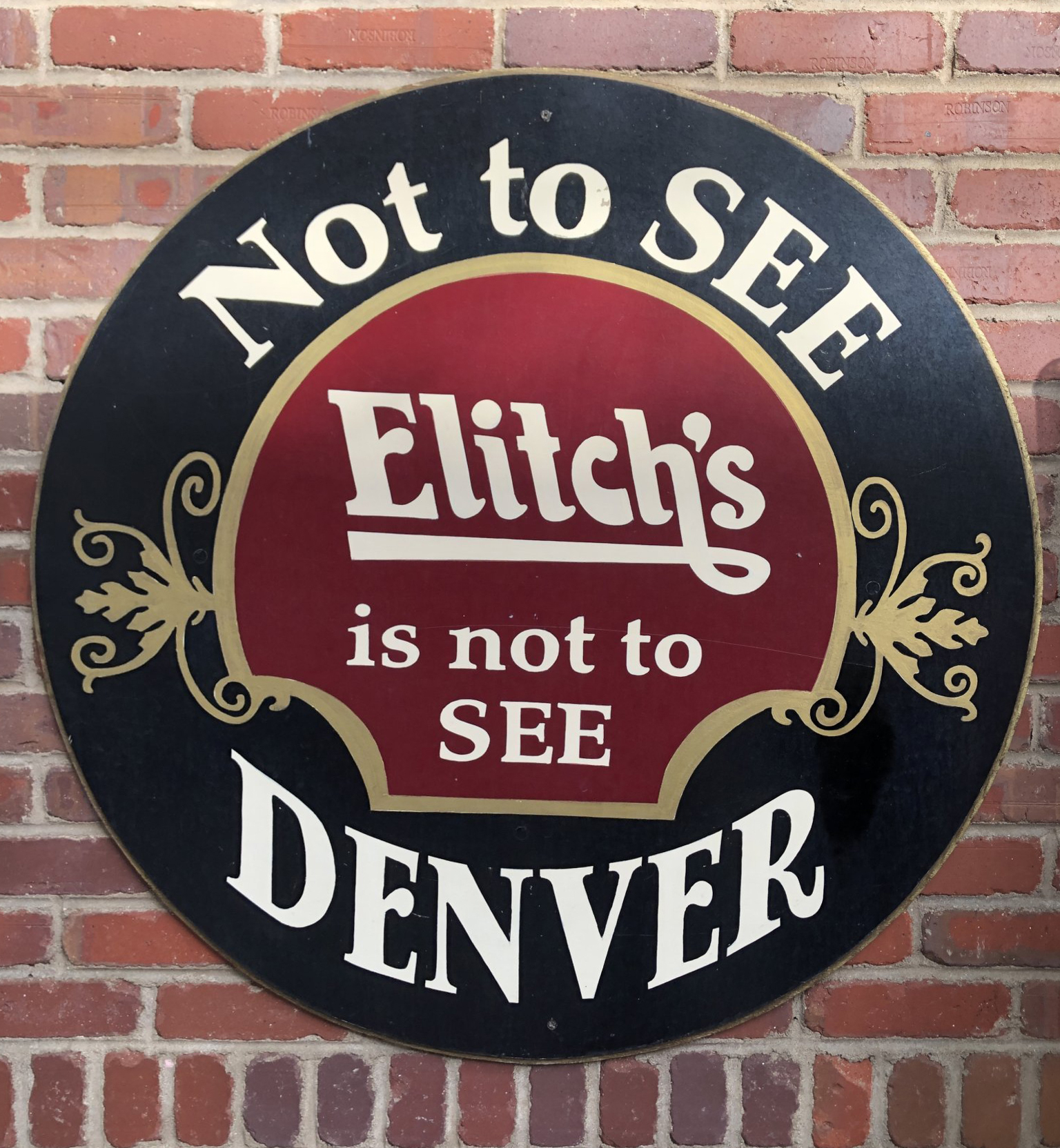
This sign really bugged me. It was really confusing to read. My kids had to ask me what it meant. It was meant to be read “Not to SEE Elitch’s is not to SEE DENVER.” But because of the way graphic design and the principles of hierarchy have trained our brains to read visual cues it really reads “Not to SEE DENVER Elitsch’s is not to SEE.” We see the outer circle as one thing and the inner circle as another. It takes a minute to realize that it is to be read down in order. Minor thing, but really bugs me. Still was a fun little park regardless.


