Faking Tilt Shift Photography with a Painting
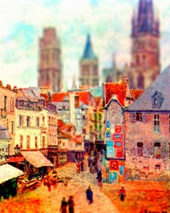
I saw these amazing images that used a faked version of tilt shift photography on some paintings by Vincent Van Gogh. These great images were created by Mathieu S of theswedishbed.com. I thought it was a cool idea to use a technique that is typically used on a photograph and use it on a traditional painting instead. Tilt shift photography is a style that by using a special lens, makes a photograph of the real world look like it’s a model (see here). When it’s used on a painting, I think it looks like a pop-up book.
Above is my first attempt at this technique using this painting by the French Impressionist Camille Pissarro. I’ll post some more of my experiments, leading to an actual tutorial to give my thoughts.
In the mean time these are good tutorials about how to achieve this effect. The technique relys on blurring parts of the image and tweaking the saturation and levels. My quick tip that I’d add is to keep a non-blurred layer underneath the blurred layer, then use a layer mask on the blurred layer to to give more control over what you want the viewer to focus on, more on that later.
Visual Photoguide: how to make a fake miniature
Also here’s a cool video that combines tilt shift photography and adds in stop motion for a tilt shift video of Disneyworld. That’s pretty cool if you ask me.
