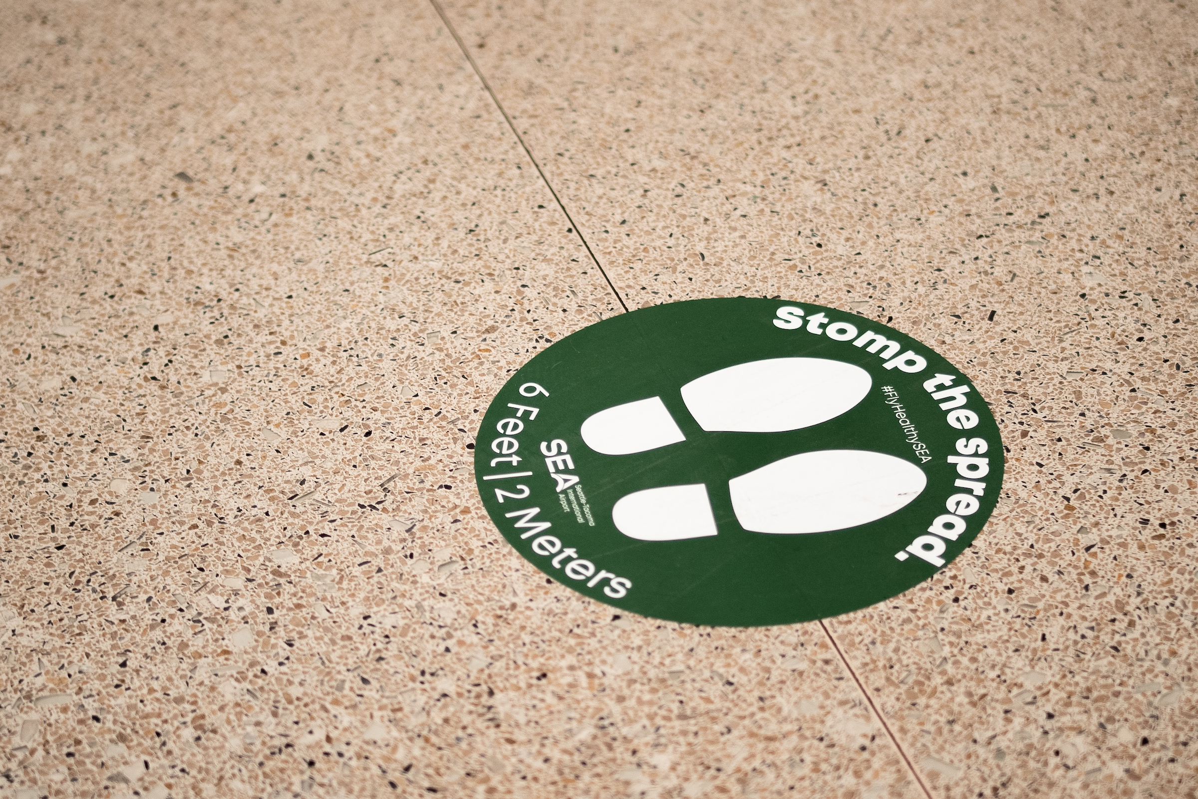
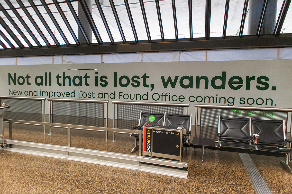
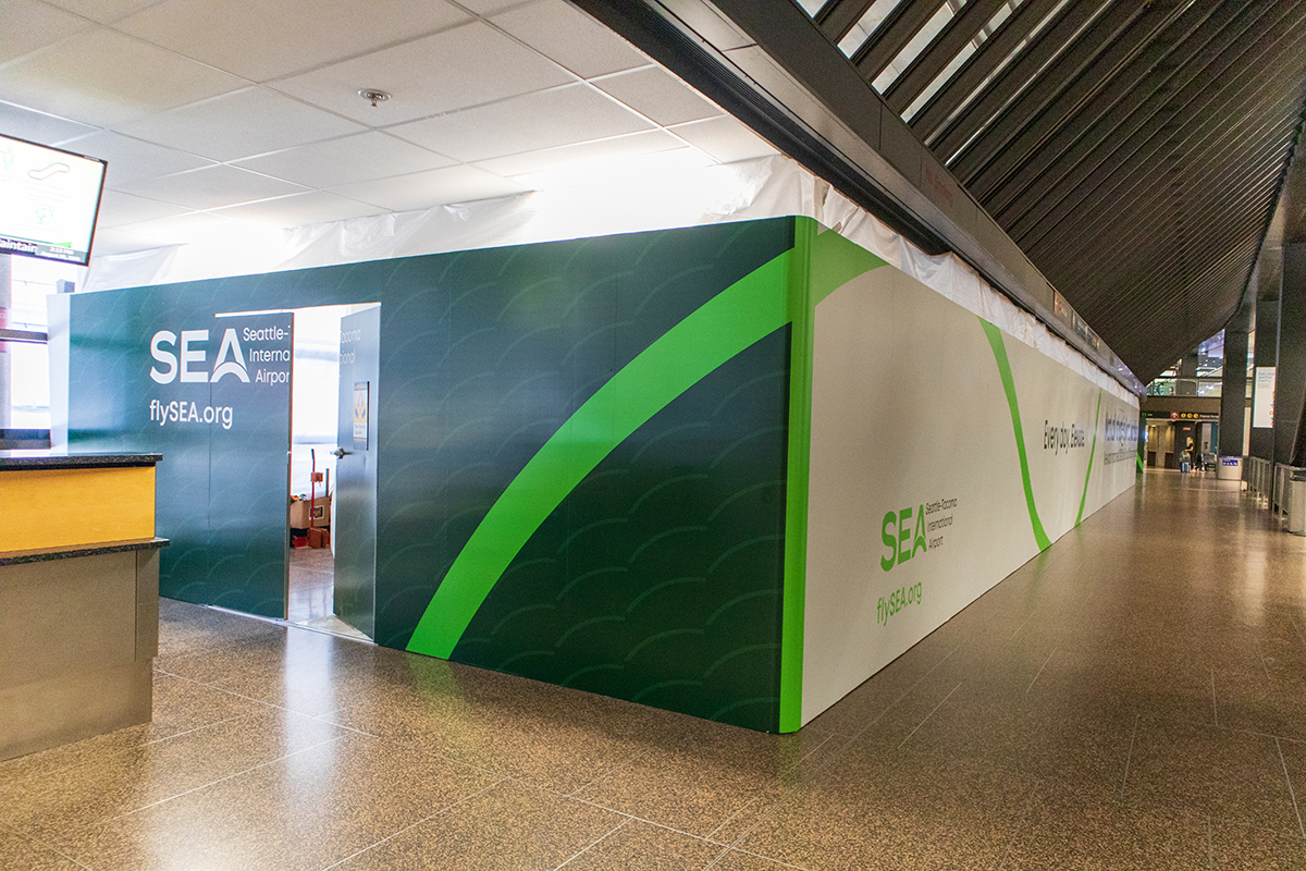
Devlin Donnelly Design

communications for the digital age
RSS icon Email icon Home icon
  • The New Yorker cover created on an iPhone

    Posted on May 27th, 2009 Devlin No comments

    dd_nymag_topper

    The New Yorker Magazine has a tradition of excellent, challenging and often times controversial covers for its weekly magazine. This was evident during the previous American election, with two covers illustrating the stereotypes of both candidates (see here and here). The propriety and tastefulness of the covers created something of a political firestorm, or at least in media circles. It gave the media a chance to feign indignation, point fingers, and flog one if their own, something that seems to be great sport amongst the fifth estate. Of course, the Daily Show had the most rational and hilarious take on the controversy see here.

    Politically the New Yorker takes risks not only in content, but also in style and technique.  I admire the way their editors and art directors take chances and have cover illustrations not only by a wide assortment of artists using a staggering assortment of medium; from oils or watercolors,  pen and ink, even the amazing illustrations of Bob Staake created using the 3.0 version of Photoshop (the latest version of the program is 11).  Now we can add the Apple iPhone to such august company.

    The current issue features a cover created by illustrator and designer Jorge Colombo. It’s pretty amazing, he drew the cover using Brushes, an application for his iPhone. According to the New Yorker he drew it while standing for an hour outside Madame Tussaud’s Wax Museum in Times Square. Which I find a delightfully quirky and surreal factoid for some reason.  Watch him creating his cover below:


    Seeing Colombo’s fantastic work being created on a simple iPhone app and the work that Staake can do using only Photoshop 3.0 is pretty amazing. It should reinforce the point that computers and software mere are tools, powerful and great tools to be sure, but they exist only in service of some other purpose. In this case we should not  be blinded by the technology and forget the meaning of the art. Photoshop, iPhones and their ilk are wildly different that the primitive brushes of the Lascaux caves, but are singular in that they are means to an end, the creation of art. I need to remind myself of this when I obsessively pour over the latest tutorials on PSD Tuts or slobber over the newest bells and whistles in the next Adobe release. Photoshop is a wicked tool, but still just a tool.

    via Gabriel Campanario / Urban Sketchers

    If your interested check out these related links:

  • Andy Warhol draws Debbie Harry on an Amiga

    Posted on May 13th, 2009 Devlin No comments

    This is pretty interesting. Andy Warhol digitally painting a picture of Debbie Harry with a Commodore Amiga at a product launch press conference in 1985!

    Add one part Andy Warhol of soup can fame, a dash of Debbie Harry of Blondie and toss in the Amiga and you get an amazing stew of early 80’s pop culture in one bit sized morsel.

    It is pretty funny watching Andy Warhol and the Commodore host interact; it is worst on-screen chemistry I’ve seen since Hayden Christensen and Natalie Portman in Attack of the Clones. However, I do love the term “leaky flood filter,” (at1:17). I think I’ll start using that when I have a poorly made layer mask or when losing to the “The Flood” in Halo. It is interesting that the host sees the leaky flood filter as a mistake and Warhol thinks it is pretty and wants to keep it. That shows the vast gulf that sometimes exists between the creator of something and the end user. It’s something that authors, designers, illustrators, film makers and developers should keep in mind when their creations are released in the world. That is, no matter what your intentions are or how good your plan is, when your creation is released it will take on a life of its own.

    via John Knack

  • Twitter Background Templates for Illustator & Photoshop

    Posted on May 6th, 2009 Devlin 3 comments

    twitter_bg_hdr

    Twitter is all the rage, but how can you make a great looking twitter page? Twitter gives the user limited, yet flexible design options. As social networking sites go, this gives you the ability to create a unique look unlike say, Facebook. But it keeps things much cleaner than the design nightmare that is MySpace.

    Creating a cool background is the key to differentiating yourself on Twitter. After reading Jennifer Farley, of Laughing Lion Design’s excellent  tutorial on Sitepoint (click here to read it) about creating your own backgrounds for Twitter. I was inspired, and created some generic templates based on her tutorial. Download the my templates and use Jennifer’s tutorial and these templates and before you know it, you’ll have a background that will make everyone a twitter about. Oh, man, I can’t believe I actually used a lame twitter pun. Twitter puns are the lowest form of humor, it makes one sound like, dare I say it… a twit. I did it again!

    downloadDownload these free templates for your own use, pass along the link if you like them. The templates for Photoshop and Illustrator with guides and are in the three most common browser sizes (800×600, 1024×768 & 1280×1024), though the 800×600 might be a bit useless, but you might as well have the complete set. These were created in the CS3, if anyone is interested I can save down the Illustrator version to an earlier version.

    Also you can follow me on Twitter.

  • A few secrets from the Deke Lounge, you ‘betcha!

    Posted on May 4th, 2009 Devlin No comments
    Photoshop? You 'betcha!

    Photoshop? You 'betcha!

    When you visit the Deke Lounge to experience some liquid learning make sure you take off your shoes. The incomparable Deke McClelland and Colleen Wheeler do another bang up job in the Lounge this week. Joining them again are Russell Brown, the Bill Nye of Photoshop (okay it’s just the white lab coats that make me think this) and John Nack Adobe wizard and wordsmith.

    This week the patrons of the Lounge discuss Layers and Filters in Photoshop. While imbibing at the Lounge,  John Nack let slip some interesting factoids about my beloved Photoshop. It must have been the strong filtered and layered Martini that freed his already verbose tongue.

    First cat that escaped the bag was that in CS4 the maximum number of layers that you could have in an individual file is somewhere on the order of 8,000. Though one of the commenter’s on deke.com say this isn’t true, but it only matters on the amount of RAM you have. The commenter labeled his comment as AFAIK,  which I had no idea what that meant. After consulting with Dr. Google, I discovered it means ” As Far As I Know.” Considering that I can’t see why you would want even 1,000 layers let alone 8,000, I don’t think I’ll spending any time testing this. So I’ll just trust John Nack on this one .

    The second secret of Photoshop John slipped was that although the maximum size of a PSD is 200,000px x 200,000px it wasn’t always this way. At one point they were testing letting a PSD have a max image size of 2 million pixels by 2 million pixels, you know in case you wanted to literally Photoshop the moon. However Adobe couldn’t find a powerful enough machine that wasn’t previously engaged trying to beat Gary Kasparov  to work on a file that large. So were stuck with only 200,000 measly pixels, who can do anything with that?

    Finally and most awesome was the revelation that the super secret  Adobe code name for the Photoshop component code is,  Fargo. As in Fargo the movie… you ‘betcha! The component code is apparently the engine that runs the software and with the head of the code cut off adobe uses this code in its other suite of programs (Flash, Illustrator, etc…) so they can use PSD’s and keep the structure of the file.  Keeping the hierarchical structure of image files, in a way turns Photoshop into a sort of database program when you jump from program to program, which is very cool.

    This is pretty interesting internal info, and it even was so cool it got Colleen to temporarily speak in the 3rd person! Listen to the Martini Hour and you’ll see. In addition to this version, all the previous versions of the code were also named after other Coen Brother’s films,  including Blood Simple, I sure hope Raising Arizona was in there.

    Man, Photoshop, programming and Coen Brother’s? TRIPLE GEEK SCORE! Also the before mentioned commentator, who claims his name is one Jeff Tranberry said:

    The component code names come from the Minnesota engineering team, specifically Tim Wright, who’s a huge Coen Bros. fan (The Coens are originally from MN).

    I can’t believe I am actually quoting someone from the internet!  But it seems legit enough to me. On a creepy note when researching this I did find that Timothy Wright, the Adobe Systems Engineer  in question donated in the 2008 presidential election. See what sort of weird information you can find on the internet! Though the elections commission said precious little about the film habits of Mr. Wright.

    Go check out the Deke Lounge…. and don’t forget to take off your shoes!

  • A Modern Totem

    Posted on May 1st, 2009 Devlin 1 comment
    A Modern Totem

    A Modern Totem

    I saw this striking image from boing boing of what I consider a modern totem or tiki statue. A group of Dutch artists carved a tree trunk into the shape of a full-sized stand-up arcade video game.

    It’s an interesting work on a number of levels, but this medium and style of video game is slowly going away. The iconic image of this style of arcade game seems dated in the world of personal video game systems, hand held gaming and the internet. I suppose there are still arcades, but this style of game system belongs, like the Jedi Knights, to an older more civilized time. Like the 80’s.

    Perhaps someday people will puzzle on the meaning of this totem and it will be as unrecognizable as the fallen Moai of Rapa Nui or Easter Island. If video killed the radio star, who killed the arcade game?

  • JJ Abrams at TED

    Posted on April 23rd, 2009 Devlin 2 comments

    I am a TED Head. I love the lectures at the TED Conference. What began as a small conference in California has grown to a global community, many million strong, focused on exchanging and spreading ideas. If you have seen some of their lectures, please do so, it’s an eye opening experience.

    Anyone who is interested in communicating and getting people to pay attention to ways to build suspense in your audience should watch JJ Abrams’ (creator of Lost, the New Star Trek, Alias and so on) great lecture The Mystery Box at the 2007 TED conference. For writers, film makers, designers or anyone who has to give a presentation his ideas on how to get the audience to want more is defiantly worth checking out.

  • 18 Great Film Studio Logo Openings

    Posted on April 21st, 2009 Devlin No comments

    Going to the cinema has always been magical for me. Perhaps the Theatre is truly the abode of the divine Dionysus. As a child, my family would take my sisters, assorted friends and myself to this magical celluloid realm. We would get some popcorn and wait impatiently for the film to begin. Eventually, I would start playing a game, I would squint my eyes slowly to mimic the effect of the lights dimming. I would do this over and over, pretending the movie was starting. I still do this, except, now I keep them shut, mostly so I can ignore the annoying pre-show advertisements that plague the cinemas like gum under the seats.

    Eventually the lights would actually dim, and (not to sound like a grumpy old man) in my day the curtains would part revealing a large white rectangle where a culture’s dreams, hopes, fears and fantasies were projected at 24 frames a second. But first there were the trailers, often times the best part of the movie going experience, then at the cinematic event horizon, when the film would actually start, you are treated to the film studio and distributors identification spot. I love this, when you see the Twenthy Century Fox logo with it’s brassy fanfare it gives me chills. It is important to note that these often are changed with different musical and coloration or special effects, this helps set the mood for the upcoming film. I’ve noted some of these.

    Here is a list of some great film studio logo openings. I know I’ve left a bunch off, let me know what ones you like.

    New Line Cinema

    I like the use of the cinema logo falling into place with the swelling music.


    Paramount Pictures

    This is a classic one. I only wish I could find the one for Raiders of the Lost Ark.

    Morgan Creek Productions

    I’ve always enjoyed the animated curves on this one.

    DNA Films

    A newer one, and it shows, that it makes great use of modern computer animation. Considering the studio makes horror and intense films it is very fitting.

    Marvel Comics

    A very exciting one that sets the audience up for a ride. Plus I love designs that harken back to some sort of historical roots. The use of halftone dots, flipping pages and close ups of characters and thought bubbles is fantastic.

    Warner Bros. Pictures (matrix variation)

    This is one of my favorite versions of a studio logo that aids the style of the film. Compare to the Regular & Looney Tunes variations.

    Warner Bros. Pictures Regular version (1997):

    Compare the Matrix Version to this and you can see how much more effective it was in stetting the tone of the film than if they would have used this much more prosaic version.

    Warner Bros. / Looney Tunes variation

    Another great riff on the WB

    RKO Radio Pictures (1930’s version)

    This is a great logo. So disctinctive and telling. It makes me feel so nostalgic for King Kong, and the Rocky Horror Picture Show, where Dr. Frankenfurther’s monster Rocky climbs up a 35 foot RKO Radio Tower, in heels no less!

    Lions Gate Films

    I like the Lions Gate Logo because it’s is great to see the Lion’s Gates of Agamemnon’s Palace at Mycenae live again. Plus I like the clock work that is resides behind the magic of film. It is the most colborate of the arts, and the animated logo hints at this fact. That the great and powerful Oz of Hollywood is a big machine behind the curtian. This one is from the horrificly bad Saw franchise, but it does set the tone.

    Lions Gate Films

    Compare the Saw version to this normal version and you can see how the Saw flavors the movie with dread from the first frame:

    MGM
    In a list like this you have to include the famous lion!

    MTV Films Logo

    A very clever use of the astronaut and the imagry of the movie theatre.

    Pixar
    Whimsy that harken’s back to the dawn of Pixar and the computer animation revolution.

    Universal Pictures (1930’s Version)

    The older logos, like RCA & Paramount are icons.

    Universal Pictures: a contemporary version

    This one always seems to get my cinematic juices flowing when I see a Universal film. It’s so classicly Hollywood, using a globe to highlght the universal lanugae of film and the film studios narcissism.

    Walt Disney (New Logo)

    If any film studio logo opening sums up the ideals of a studio better than this one I can’t think of it. It’s so full of imagination and child like wonder, plus it sells the iconagraphy of the studio like no other. Not only is it an trademark for the company, it’s also ad for the theme parks. It is also an homage to Peter Pan; note the third star to the right in the opening shot and Hook (or is it Jack Sparrow’s) Pirate ship on the river

    Twenty Century Fox

    I’m saving the best for last, maybe because I was such a fan of Star Wars, this will always be the quissential movie opening for me.

  • More Faux-Nostalgia

    Posted on April 14th, 2009 Devlin 4 comments

    steampunkIt is very fitting that I saw an article on Boing Boing about a new issue of Steampunk Magazine being released after my last post on the work of Bruce McCall. Nothing says Faux-Nostalgia like Steam Punk; that is the achingly sentimental yearning for a future that never happened. In case you don’t know Steampunk is a genre where modern inventions like computers and the information age happened in the age of Steam, during the height of the Industrial Revolution. Check it out, it’s a really great magazine.

    London Rooftops, by Raphael-Lacoste

    London Rooftops, by Raphael-Lacoste

    This is a genre that I have liked, mainly because Victorian London is such a rich place for the modern imagination to play. From Marry Poppins to From Hell the place is a fascinating place. Coal darkened skies cast long shadows on cobble stone streets lit by flickering gaslight. Every twist in the street could lead to a knife wielding barber or into the comforting embrace of  the Dawes, Tomes, Mousely, Grubbs, Fidelity Fiduciary Bank, only Tuppence required as entry.

    In my imagination Victorian London is a place of squalor on one side and great wealth and absurd tradition on the other. A place on the cusp of modernity, where aristocrats and plutocrats ruled over squalid slums. Not in excessive greed, more with excessive pomp and a certitude of their own righteousness. A time that seemed the sun would never set on the British Empire, then the trenches, artillery and machine guns of Verdun wiped that world away in one fell swoop. It was a tragic period in many ways, as the immortal works of Dickens and Shaw remind us, the distance between us and then is long enough for a bit of romanticism to flourish. And you can read more of that in Steampunk.

    • Steam Punk Magazine Link
    • More information on Steampunk Link

  • Nostalgia for a Future that Never Happened: The Work of Bruce McCall

    Posted on April 13th, 2009 Devlin 3 comments

    Bruce McCall says in this hilarious and very interesting TED presentation that Nostalgia is the most utterly useless human emotion. I don’t totally agree but I see the point. Nostalgia if taken to extreme becomes a mild case of depression and self-deception. The past is never as great or as bad as it seems and nor will the future be as wonderful or as terrible as we can imagine. Setting that aside, please check out this amazing lecture, McCall is a very witty and gifted artist.

    I am fascinated by McCall’s style of art, it touches on many of my passions, science fiction, mid-century design and art that doesn’t take itself too seriously. It’s a mixture of the low-brow art movement with a dash of Norman Rockwellesque technique.

    Here are the descriptions of his made-up but wonderful terms, these are things that designers and science fiction writers can and should use when it is appropriate to their work:

    • Tomorrowland Retro-Futurism: from wikipedia

      Tomorrowland Retro-Futurism: from Wikipedia

      Retro-futurism: Looking back to see how yesterday saw tomorrow… and they are always hilariously wrong. Peeked in the 1930’s. Automotive retro-futurism is a big component of his work, the way the past saw cars looking in the future… fins galore!

    • Techno-Archaeology: Digging back and finding past miracles that never happened, usually for good reason, that is they wouldn’t have worked or been a disaster… flying cars.
    • Faux-Nostalgia: Achingly sentimental yearning for a time that never happened.
    • Hyperbolic Overkill: A way of taking exaggeration to the absolute ultimate limit just for the fun of it.
    • Shamelessly Cheap: A joke that has no meaning but is strangely funny in and of itself.
    • Urban-Absurdism: Making life in New York (and city life in general) even weirder than it is.

    The most important thing that McCall said about this style of art (and literature I assume) is that authenticity adds immeasurably to serious nonsense. That is the world presented in Faux-Nostalgia has to look and feel real. The machinery, characters, general look and world have to breathe. In this vein Alan Moore and the many artists he works with do this better than any one else, to see what I mean check out The League of Extraordinary Gentlemen (though please skip the film). Other things that fall in to this same general category:

    • The world of Bruce McCall

      The world of Bruce McCall

      Check out McCall’s great work, All Meat Looks Like South America Link

    • The “new” Tommorowland at the Disney theme parks. Link
    • The once defunct and highly under appreciated RPG from Game Designer’s Workshop: Space: 1889 Link
    • Bruce McCall’s Website Link

  • Free Survivor Tribe Swatches for Adobe Illustrator

    Posted on March 21st, 2009 Devlin 3 comments

    survivor_header

    I am very excited that a new season of the greatest show in the history of Television has returned. No, not Heroes or Lost, it’s Survivor of course!

    In  honor of the sacrifice of my Thursday Nights and countless hours otherwise spent on productive enterprises now devoted to contemplating  the fate of strangers eating insects halfway around the globe;  I am giving away my collection of Survivor Tribal color swatches for Adobe Illustrator for free. As a fan/addict of the show I’ve been collecting the colors of the tribes or teams and creating swatch pallets for them. These swatch palettes have the  color of each tribe up through the last season, Survivor: Gabon.  View the swatches in the list view in Illustrator and you will see that each swatch has the name of the season and the name of the tribe that the color once proudly represented.

    download1

    DOWNLOAD SURVIVOR SWATCHES!

    Swatches for Illustrator / Adobe Creative Suite ASE swatch palettes.

    Enjoy the swatches, but let me digress a bit on why I find this program so interesting.
    Why do I like this silly, contrived show so much?  I’ve often wondered that myself. Why devote so much mental energy guessing the effect of every conversation, challenge, reward, moon phase, tidal fluctuation or ascending astrological aspect will have on the outcome of the game? Why follow the outcome of a show that I have no stake in? Why do I do it? Addiction to a trivial show? Probably, but I’ll try to rationalize it, if for no other reasons than my amusement and to think about Survivor even more.
    The conclusion I’ve come to is that Survivor combines several elements that I find irresistible. These irresistible elements that Survivor combines are:

    The romantic notion of escape
    •    The exotic
    •    Voyeurism
    •    Cannibalism

    Escape

    In an age of anxiety men seek a refuge. Because of some deep urge, constant throughout history, troubled men traditionally dream of islands, possibly because of the smallness of an island invites the illusion that here the complexities of continental societies can be avoided, or at least controlled. This is a permanent, world-wide dream.”
    - James A. Mitchner & A. Grove Day, Rascals in Paradise, Turbulent adventure and bold courage on the South Seas.

    Illusion of Paradise

    Illusion of Paradise

    Survivor is endowed with the romantic ideal of escape. The show is a game, but the mythology of the show is no mere game. It begins with the “exile” of 16-20 western “castaways” or “survivors” to an idyllic tropical island or other exotic locale; and we the audience go along for the ride. If you could draw blood from Survivor and examine its DNA, you would find the works of Daniel Defoe, Robert Louis Stephenson, Jack London, Herman Melville and Joseph Conrad forming the rigid base pairings of the show.

    The idea of escaping the world to craft a new civilization in paradise is very inviting. If you think I’m been bit grandiose here, you may be right, comparing as show like this with giants of literature; however the show does coat tail off of many of the ideas and images in the works of those masters. After all, it’s telling that the precursor to Survivor was a Swedish program called Expedition Robinson, ala Robinson Crusoe.

    The Exotic

    Survivor is typically set on a tropical island in the South Pacific, though sometimes the castaways find themselves marooned in the vast jungles of the Americas, Africa or Asia.  These exotic locales feed into this feeling of escape.

    Escaping to a deserted island is one thing, but the exotic isn’t complete without the willing wahine and the noble savage. Indigenous cultures are present in the show, but often in  the limited shorthand of the romance of colonialism. Every season some of the castaways win a challenge and are ferried to a village by the producers and participate in some sort of contrived bacchanal.  The iconography of the native cultures are used not really to illuminate, but to be used as set pieces for the contrived drama for the show.

    Idol from Survivor Fiji

    Idol from Survivor Fiji

    A designer I really love the pop-exotic art direction in the show and the pop culture exotic flair. In fact, I have a 4 foot tiki statue in my back yard! Survivor has always had a wonderfully kitschy tribal council set where the cannibalized members of the show are digested into the jury. The set is full of imagery rife with the exotic idols, fire pits, rattan, wicker, native(ish) art and the ubiquitous bamboo.  The show changes it’s sets and iconography to suit the theme of each show. Be that pirates, African Tribesmen or South Seas cannibals, the decorations fit the theme and highlight the romantic exotic ideal of that environment.

    The most vivid “primitive” icon is the “immunity idol,” a totem that keeps the player or team safe from going to tribal council and getting voted off the island. The idol itself is usually a stylized vision of some primitive god and it lives somewhere halfway between the reality of the local culture and the idea of the exotic enchanted land where that particular season is set. A style that has it’s DNA, not  in the native styles of where ever the show is located, but in the Disney’s Adventureland,  Trader  Vic’s  restaurants and glorious midcentury Polynesian- Pop ephemera. The immunity idols themselves are fantastic pieces of art that look as if they should grace the covers of the great Exotica legends Lex Baxter or Martin Denny, or be rendered in glorious two dimensions by SHAG. Hopefully they are being preserved for future Urban or pop culture Archeologist; preserved for a future Sven Kirsten.

    The Voyeur and Grub worms or another reason to hate Kobe Bryant.

    Kobe Shoots the worm.

    Kobe Shoots the worm.

    Sure it has an exotic location, but what makes it a fun is the addition of two other elements, first it is a reality show, so there is a strong voyeuristic element to it. It is interesting to see people ostensibly like you or me and putting them in such a strange  and stressful situation and seeing how they react. I first discovered Survivor not because of any foresight but because of Kobe Bryant. I accidently found Survivor half way through the first season in Borneo. I was watching the NBA finals and being disgusted that the Lakers were blowing out my man Reggie Miller’s Pacers, I turned the channel and saw a guy eating a bug. Now this caught my attention!  So you can blame my devotion to Survivor to equal parts Kobe Bryant’s jump shot and the epicurean delight of grub worms. All those Thursdays lost thanks to that jumper and that bug.

    Cannibal Contestants

    The show is a competition, that is why I think it became so popular. It had escape, exotic locations coupled with the voyeuristic car wreck. But we’d see all that before.  Survivor was the first reality show, as far as I can remember, that turned the contestants into cannibals.

    The Lotu, or the Worship, was progressing slowly, and, often, in crablike fashion. Chiefs, who announced themselves Christians and were welcomed into the body of the chapel, had a distressing habit of backsliding in order to partake of the flesh of some favorite enemy. Eat or be eaten had been the law of the land; and eat or be eaten promised to remain the law of the land for a long time to come.”
    -Jack London, Whale Tooth

    Survivor Todd Chows Down

    Soylent Green Burger?

    The premise is very interesting. First, the contestants have to work together to create some sort of community and find comfort in the wild. Of course it isn’t a real survival situation, the production company won’t let them actually die, but they do let them get very, very uncomfortable. In a pseudo-survival situation like this how do people react? Do they band together or save themselves at any price. In the real world people most often band together. However, the insidious genus of the show comes into play here,  since only one individual can win. In the real world groups win, but this is a microcosm of the world, so how does an individual impose their will without alienating everyone?
    This makes  one survivor Out Wit, Out Last and Out Play and thereby cannibalizing friend and foe alike. To win you have to cannibalize other members, but doing it in such a way that they will still vote for you as members of a jury that pick the winner 2-3 finalists.  Kill and eat your rivals but be nice about it. To win survivor, like chess you have to sacrifice people on your own side. That is a difficult thing to do on many levels. Watching it unfold tells something about the human condition. What I am not totally sure, since the show is on many levels artifice, to answer that I’d have to stop paying attention to all the eating of bugs.

    My visions were of shipwreck and famine; of death or captivity among barbarian hordes; of a lifetime dragged out in sorrow and tears, upon some gray and desolate rock, in an ocean unapproachable and unknown. Such visions or desires- for they amounted to desires- are common, I have since been assured, to the whole numerous race of the melancholy among men…”
    -Edgar Allen Poe: The Narrative of Arthur Gordon  Pym