Case Study: The Revenger’s Tragedy Initial Design
This is another case study posts featuring some of my recent work. The purpose of these posts is to share my design philosophy and methodology.
I have been working on the marketing collateral for the upcoming GreenStage production of The Revenger’s Tragedy by Thomas Middleton and directed by Sarah E. Budge. The play is “…a vivid and often violent portrayal of lust and ambition in an Italian court, the play typifies the satiric tone and cynicism of much Jacobean tragedy. The play fell out of favor at some point before the restoration of the theaters in 1660; however, it experienced a revival in the twentieth century among directors and playgoers who appreciated its affinity with the temper of modern times.” –wikipedia
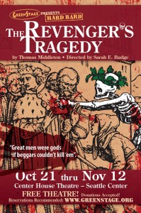
Musing on the theme I decided to use a wood cut from the fantastic German artist Hans Holbein (1497-1543) as the basis for the design. The wood cut is entitled “The Duke” from his Dance of Death (1538) series. These woodcuts are an artistic representation of death imposing its will on the living and the horror and the tragedy that ensues. It is for that reason, as well as the stark beauty of the art, that I felt these images would work for the design, since they perfectly summed up the theme of Middleton’s play.
Another major deciding factor in the design’s look and feel was the the unique style of the production that GreenStage is putting together. It is a style that they call “Hard Bard,” which is the performance of a classic play (often times Shakespeare) with the original script and dialog, but performed in a campy, bloody style. They are very funny, raunchy and often times the audience ends up being sprayed with fake blood. Think of the classic black knight sequence from Monty Python & the Holy Grail.
The design is crafted to a somber and classic piece with beautiful textures, illustrations, color and typography and then be juxtaposed with realistic and gruesome blood splatters foreshadowimg that, while this is a classic play, there is something very different about what you can expect. Finally, having the figure of death being the only character colored is meant to highlight the role that death will be playing during the play.
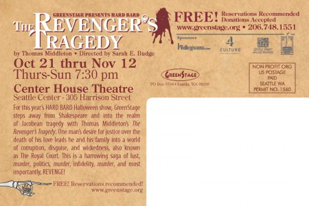
This was the initial concept I developed, thought it wasn’t the final version. As the production continued the play took a different, more modern tact, in terms of set and costume design. To show that, we radically changed the final design, which I will share in the upcoming days. In the meantime let me know what you think of this design. For a closer look, check out the high resoultion PDF.
Also, if you are interested in the play check it out, it is free!
The Revenger’s Tragedy
October 21 through November 12, 2011
Shows Thursday through Sunday at 7:30pm.
Center House Theatre – Seattle Center
Free, but reservations recommended. Click here for more details…





[…] Case Study: The Revenger’s Tragedy Initial Design Okay a bit of a shameless plug for my own article, but it’s a nice post that exposes my design philosophy and methodology. Take a look at how I came up with a design for GreenStage’s production of The Revenger’s Tragedy. […]