
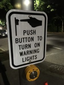
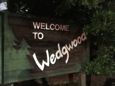
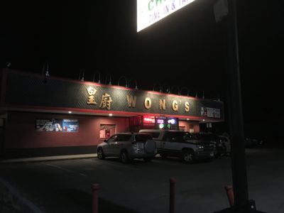
Vernacular Typography on 35th Avenue
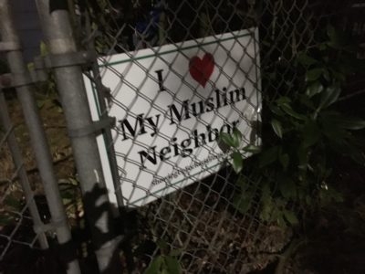
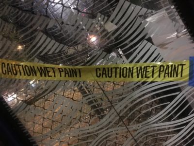
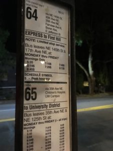
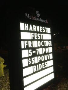
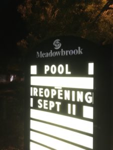
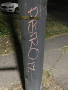
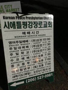
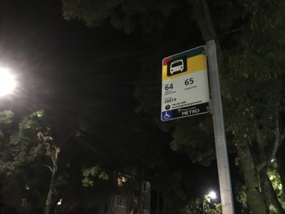
I went on an night stroll through my neighborhood recently, in addition to the exercise and fresh air, I find it to be a great time to be alone and think. On this stroll I paid particular attention to the various signs, graffiti and other bits of the vernacular environment around me.
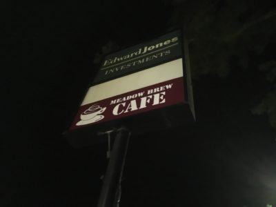
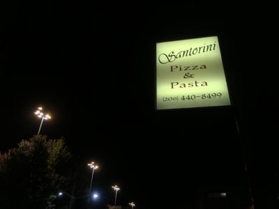
One thing I enjoy about each of these pieces is the fact they are pure graphic design, each sign is trying to communicate a particular message to the audience. None of this is fine art trying to express the inner feelings of and artist, but is intended to solve a problem, intending to grab the passerby’s attention and let them know this business is here and is ready to do business. Even the graffiti in this case is more like a sign, the tags acting like simple signs that let other’s they are here, just like the gas station or pub call to their audience.
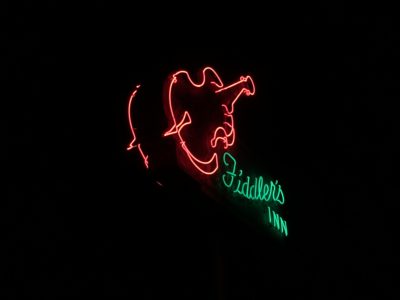
Some of the designs are good, some are bad; some bland and some grabs the attention. With the exception of the fantastic Fiddler’s Inn neon sign these are all pretty mundane, but all of it was designed by someone. Time was spend in the execution, production and installation of each piece. I think I like that best of all, knowing that another designer spent time planning and putting it together. I always find it interesting to see all the different solutions for the same fundamental problem.


